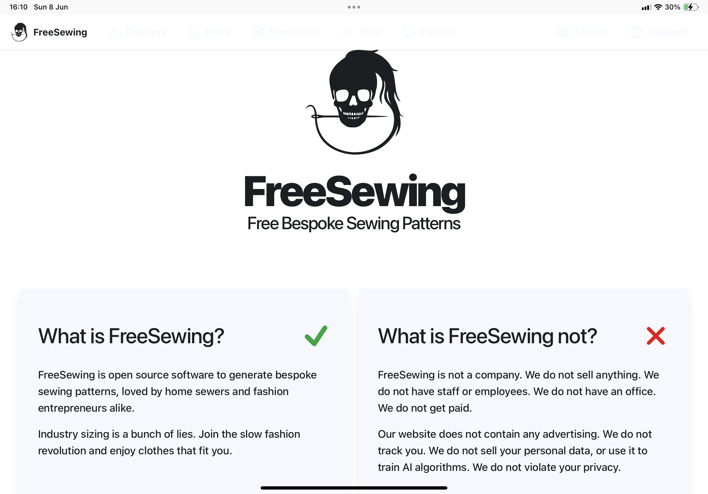
Hi, using an updated ipad w/ safari some of the font-colors come out so light that it’s impossible to read. Don’t think I’m doing anything unusual w/ my ipad setup (css overrides, accessibility, etc). I just started messing around with FreeSewing this week, so don’t know if this is something new or not.
This is related to the (automatic) dark mode / light mode selection. It’s a known issue, but has proven tricky to reproduce.
As a work-around, can you switch either your browser or OS to dark mode? That will make the text much easier to read.
Could this be resolved by the text colours being changed to match the rest of the text that’s visible? Maybe add an underline to denote a link, instead of a different colour?
It’s a bug is that the text color is not the color it is supposed to be. Changing the text color doesn’t help if it doesn’t end up being what it’s supposed to be.
That being said, we pushed updates earlier today, and I for one cannot reproduce this any longer. If you can, please let us know.
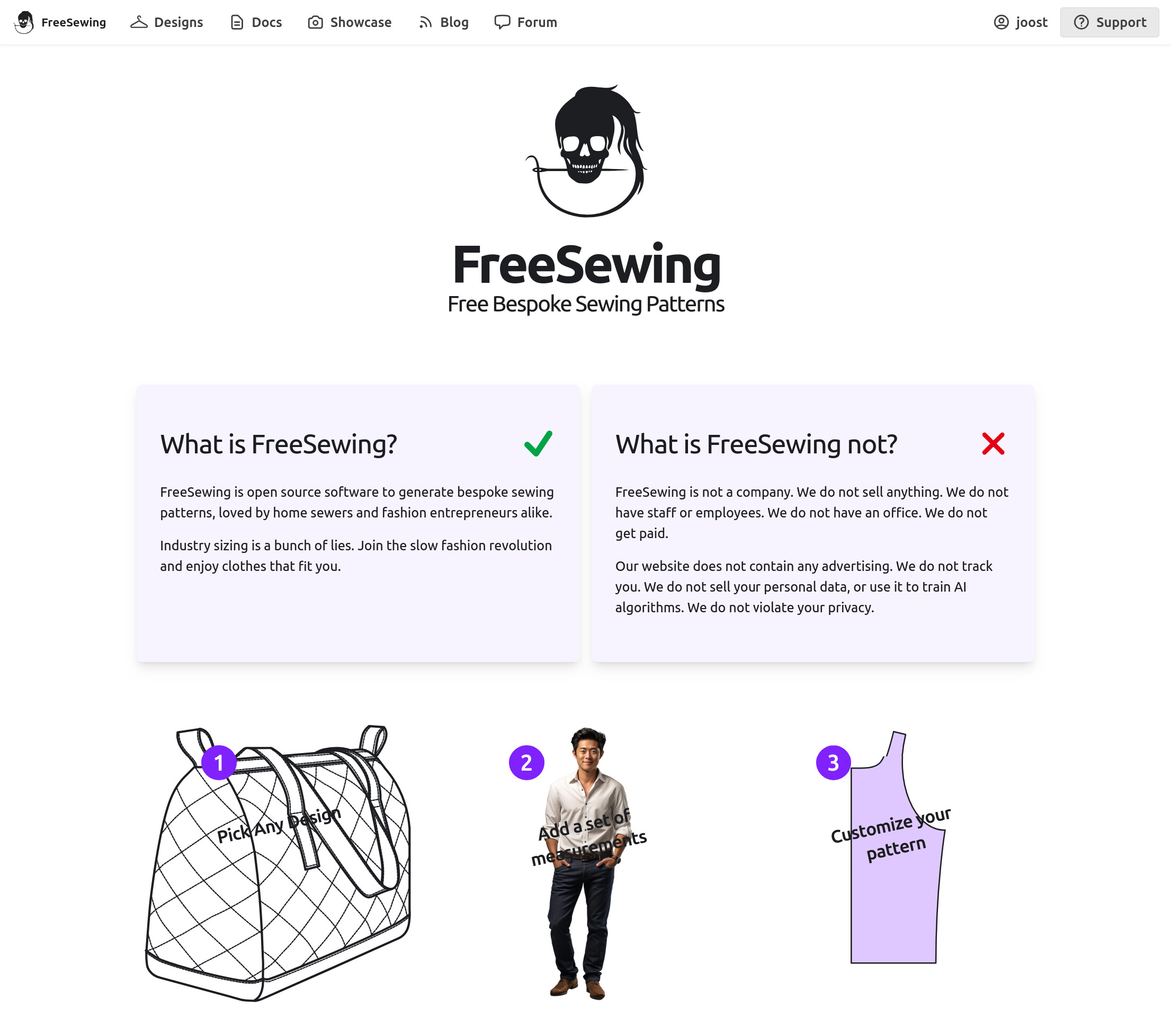
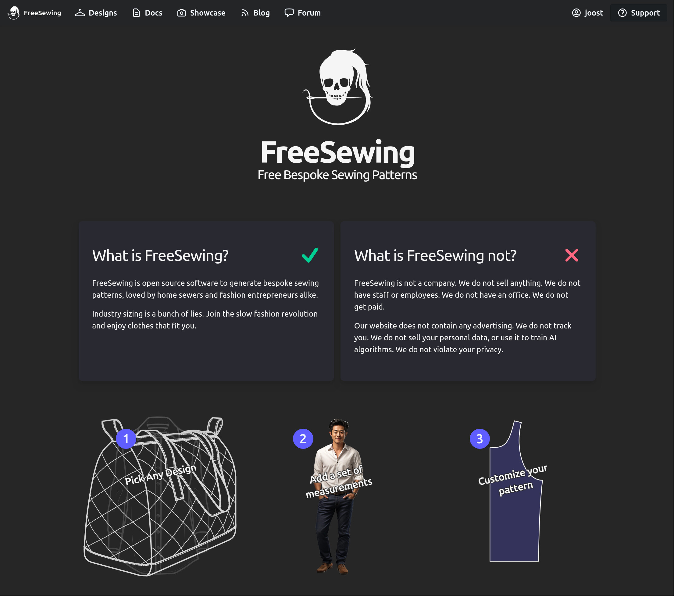
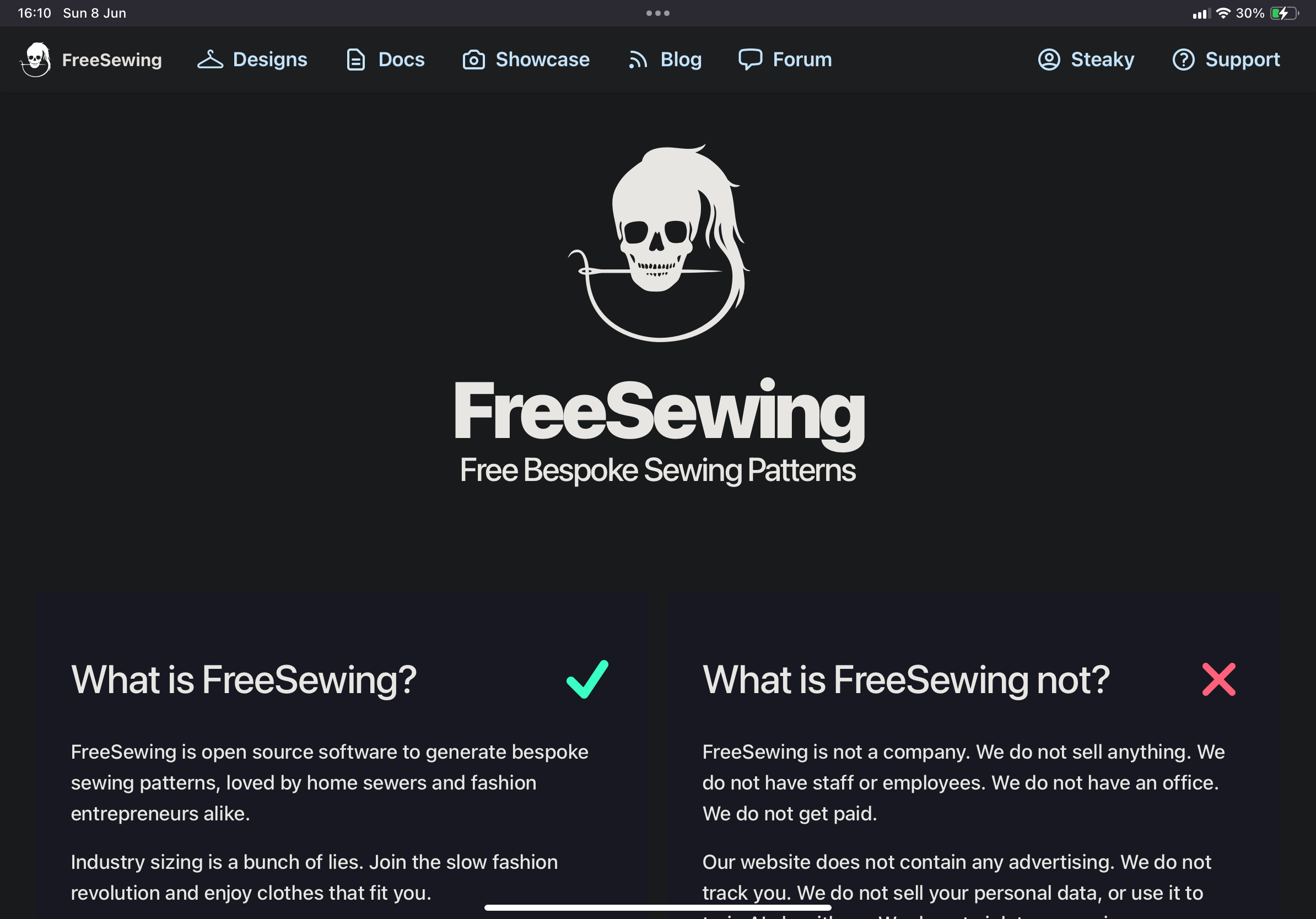
This is what it’s supposed to look like:
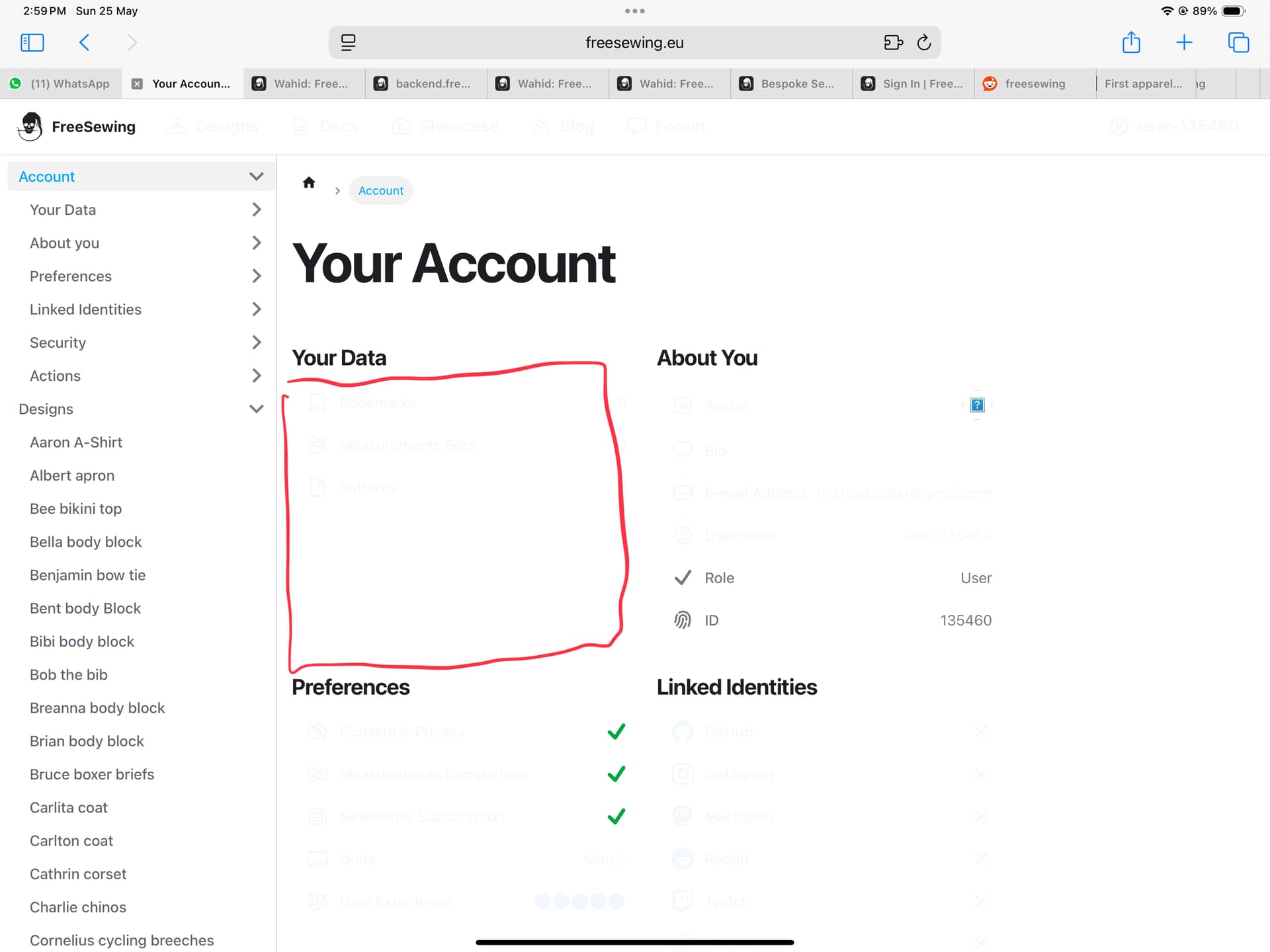
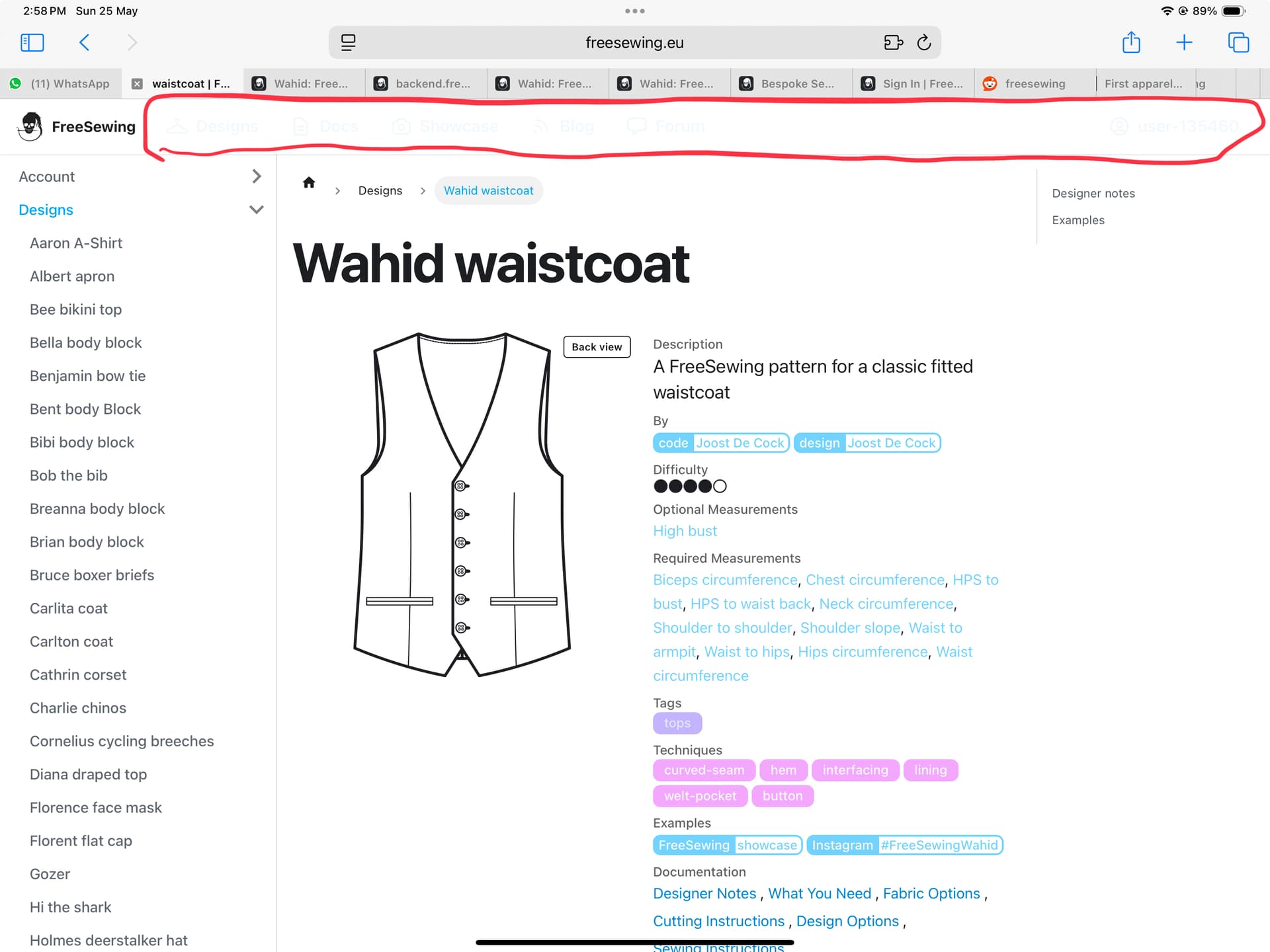
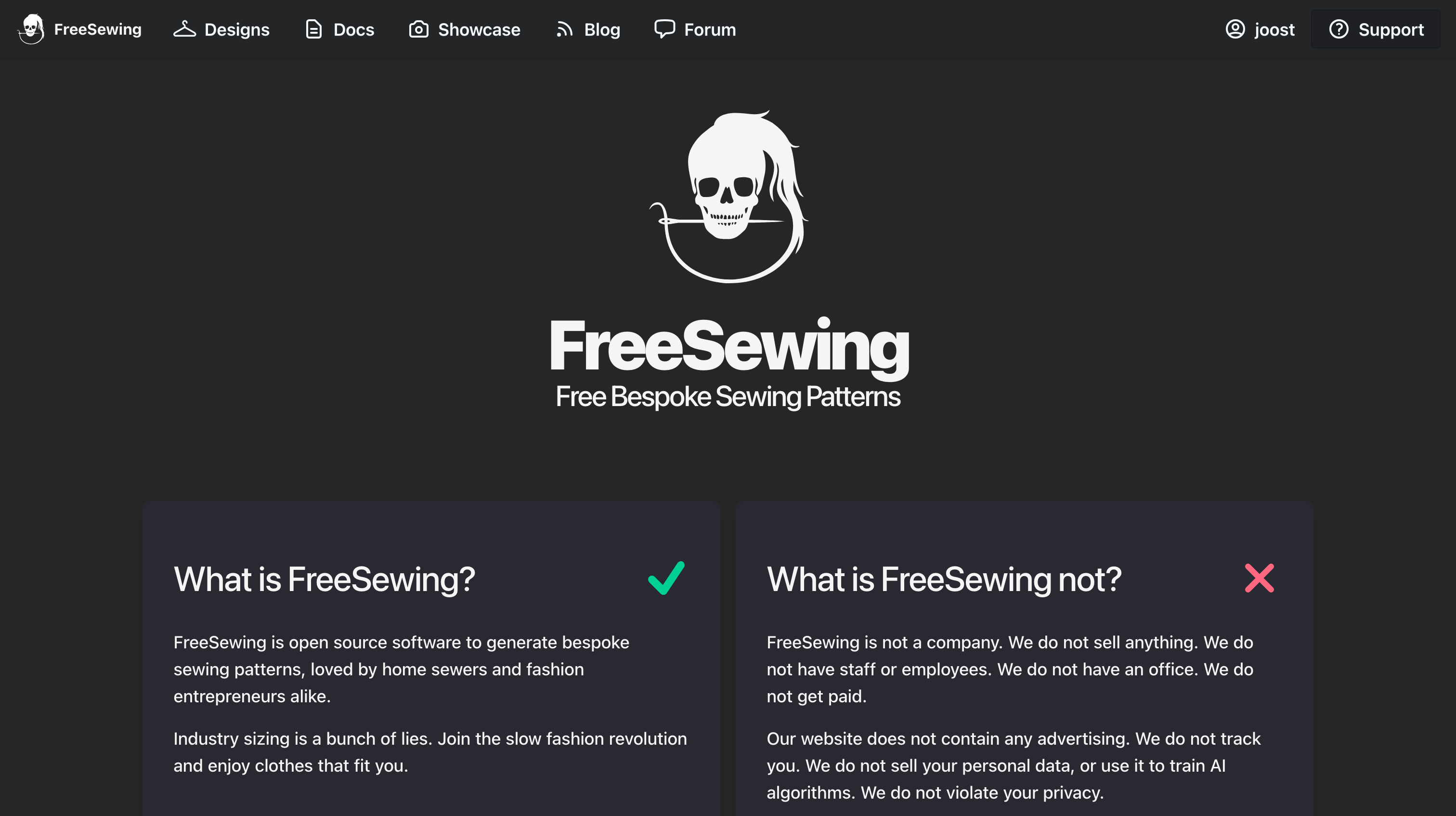
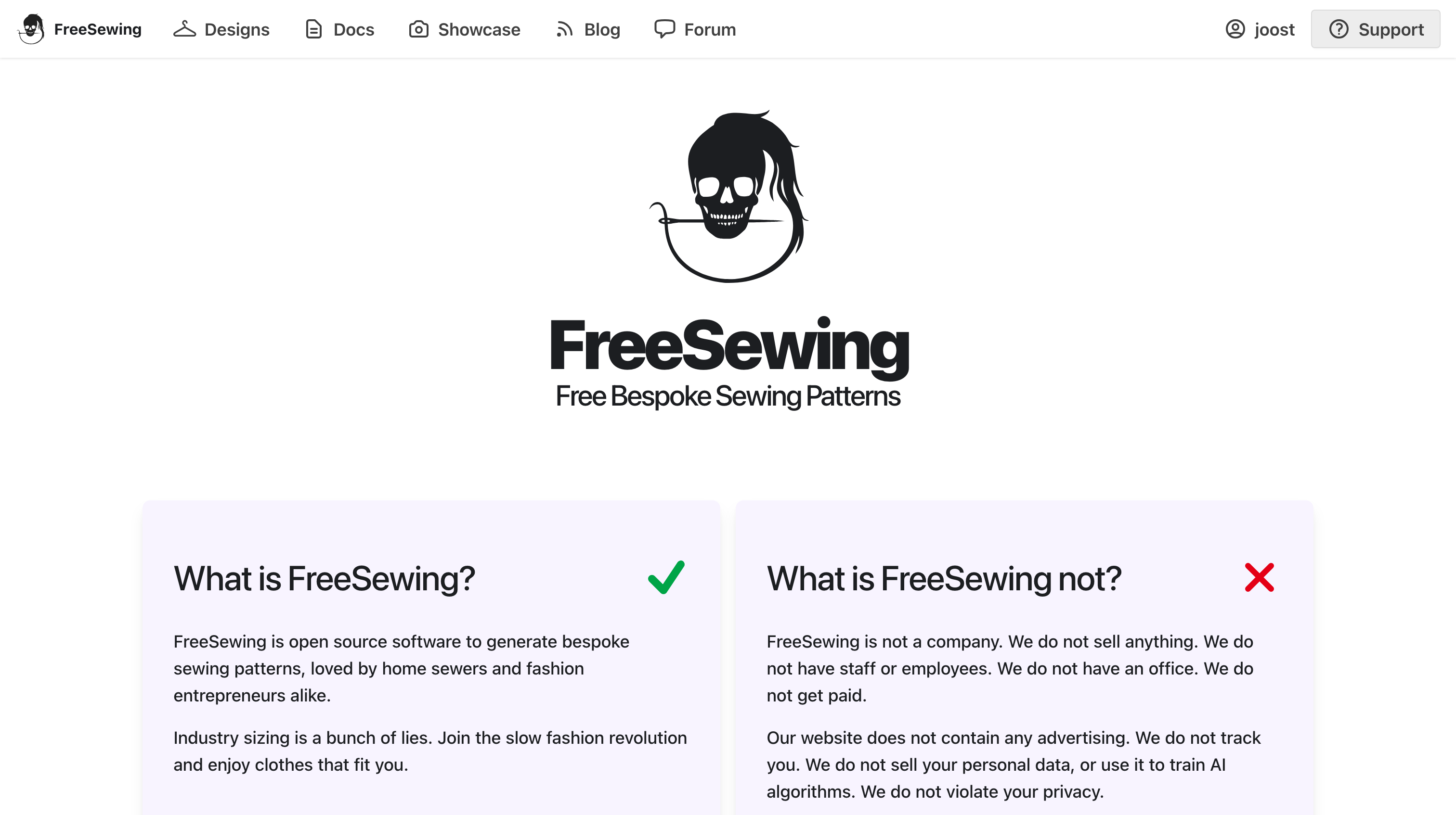
I’ve just cleared my cache before visiting the site in a fresh tab and this is what I’m seeing. Browser is Firefox on iPad iOS. System is in dark mode and I toggle between light and dark mode in the browser
In both cases the colours are not correct. Unfortunately, I do not have an iOS device but I’ll see if I can reproduce it on Mac.
I can’t find how to view the source code (it appears apple doesn’t want people to have access to that), so I can’t share that, in case something has been changed on the ipad. I don’t have the issue on my windows laptop, which is how I mostly use the site now. But do have it on my ipad and iphone.
I can reproduce the milder version of the issue (menu text is light blue while in dark mode, so legible but not correct) in Firefox in iOS by enabling ‘Night Mode’ in the browser settings.
@Steaky, can you check your ‘Night Mode’ setting and whether toggling it has an impact on your side?
1 Like
We know there’s an issue with firefox on IOS, but I don’t have an IOS device so that makes it hard to debug.
For the record: It does not matter whether the color you see in the navbar is blue, or red, or whatever. It’s supposed to be black on white, and white on black in dark mode. Anything else is a bug.
1 Like
Changing the device setting makes no difference to how it appears when I toggle the browser between light and dark. It appears the same as in my screenshots above.
If I switch to safari and change the system between light and dark mode, it looks pretty much the same as above also.
Now that I’ve found a way to reproduce the issue, perhaps I can help with debugging?
1 Like
I’ve found some JavaScript WebKit toggle settings under Advanced for safari, could that be affecting how the site appears?
No, the issue is not related to Javascript. It’s entirely related to CSS and specifically how the styles from Docusaurus, TailwindCSS, and DaisyUI override each other in unexpected ways.

I’d be very interested to hear whether @Steaky @anna_puk @user-135460 or anyone else for that matter can reproduce the styling issues on this preview link:
Thanks in advance for letting me know.